Photography & Imagery
RoadmapImage system for the TpGroup brand family: a set of rules for photography subject matter, treatment, and usage; illustration style; icon system; and delivery formats per platform. Complements iconography and extends it into full visual storytelling.
Photography rules
| Aspect | Rule |
|---|---|
| Subject matter | Sierra Leone and West-African contexts authentically portrayed; people, places, and products local to the brand story. |
| Composition | Human-centred. Eye contact or action-in-progress. Avoid generic stock imagery. |
| Colour treatment | Warm, slightly desaturated. Avoid heavy filters. Brand accent may appear but should not dominate. |
| Aspect ratios | 16:9 (hero, video), 4:3 (editorial), 1:1 (social, avatars), 3:4 (portraits). |
| Licensing | All photography must be rights-cleared for web, mobile, desktop, and print. |
Photography examples
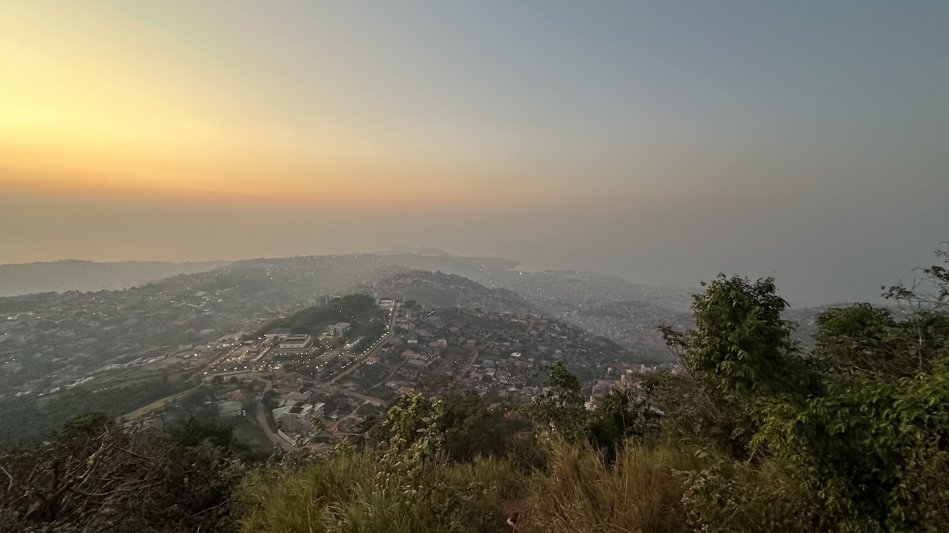
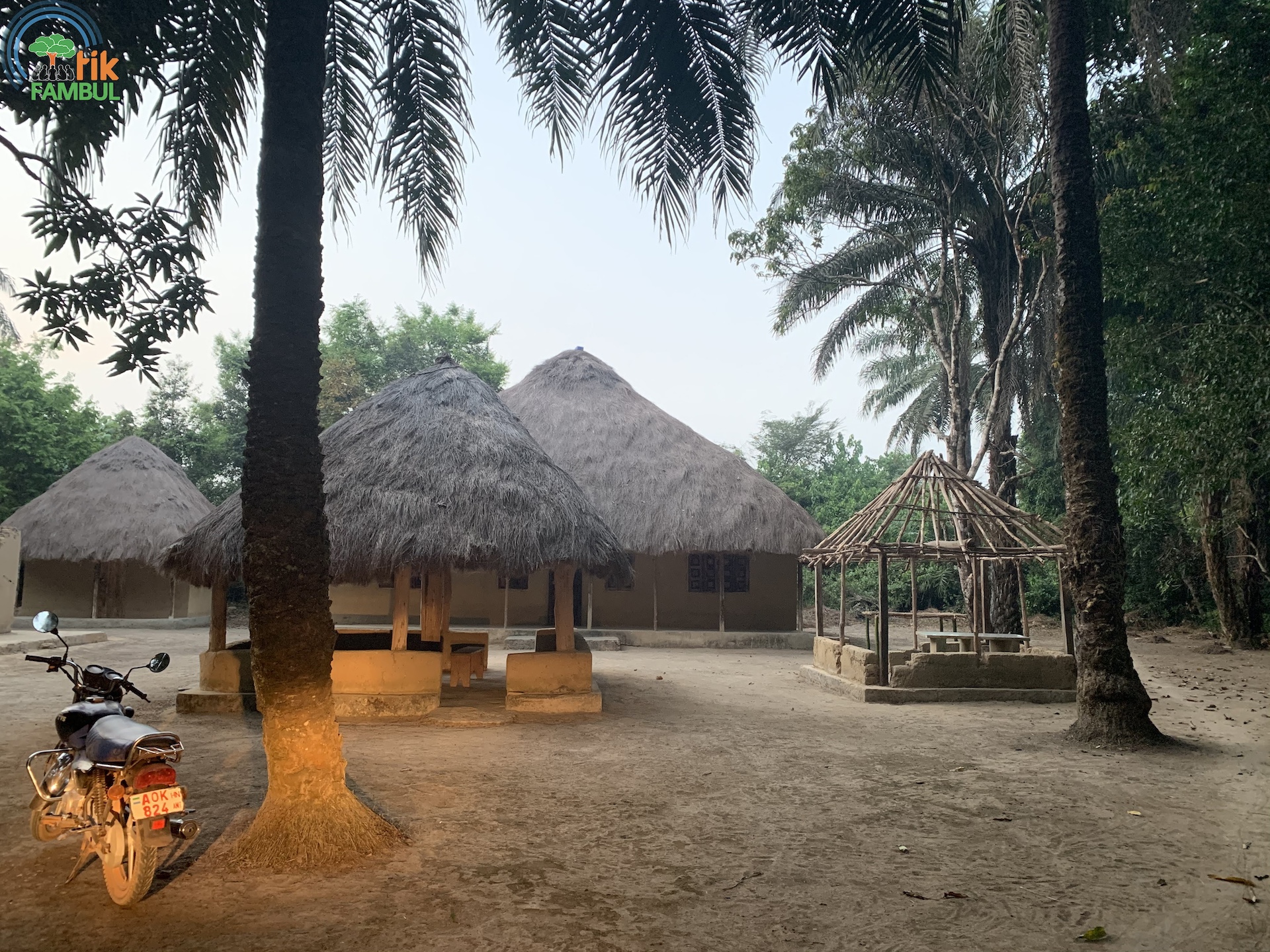
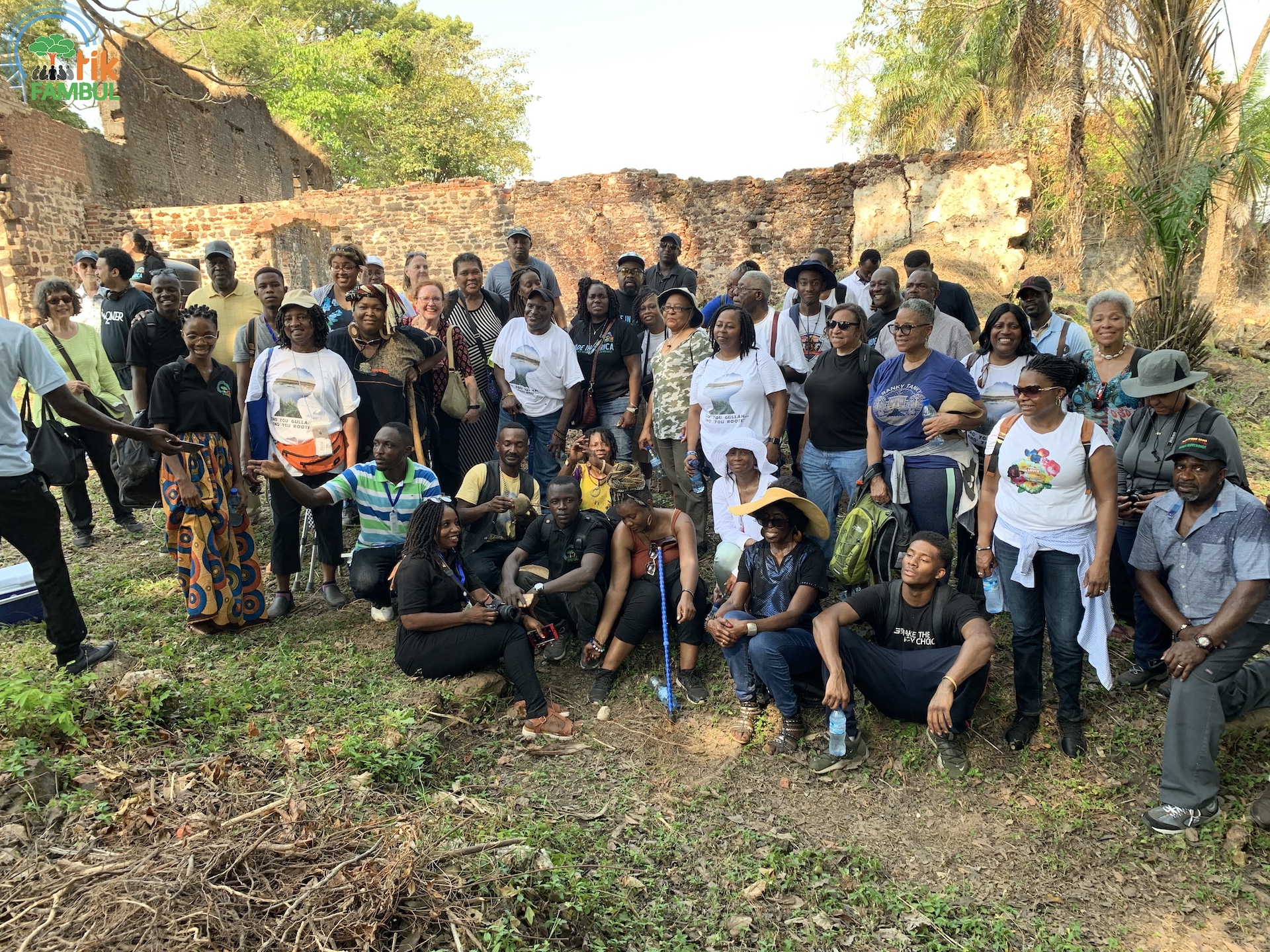

Illustration style
The TpGroup illustration system uses geometric shapes, a two-brand-plus-neutral palette, and a flat, open style. Illustrations should feel crafted but not overly decorative. Export as SVG; platform-specific conversion is automated: PDF for iOS, VectorDrawable for Android, XAML for WinUI, EPS for print.
Authored as a single inline SVG — geometric primitives, brand-accent fill, neutral surface, open negative space.
Iconography
The default icon set is Lucide at a 24px canvas with 1.5px stroke. On Apple platforms, SF Symbols are preferred for OS-affordance icons (share, bookmark, settings) while Lucide covers everything brand-owned. Android prefers Material Symbols for OS affordances; Windows prefers Segoe Fluent Icons.